
How To Pick The Best Brand Colors
Have you ever noticed how brand colors tend to resonate with what you “feel” about that brand? The green of the Whole Foods logo is practically synonymous with fresh, organic food while the red of the Nintendo logo resonates with their energetic gaming brand.
This is the psychology of branding. When a company like Insurance Websites designs your custom brand website, they take into account your branding, color schemes, and how your audience perceives your brand. All of this comes together to shape the color psychology of branding.
Let’s take a closer look at the color science behind branding.
Importance Of Colors 
The psychology of branding is all about defining the importance of brand colors.
Having the right colors is incredibly important for your brand. In fact, research has proven that audiences tend to favor brands that have colors that make sense with their brand identity. The colors that you choose for your branding can help situate your company in a larger industry, direct your audience, and even signal the types of products and services that you have available.
There’s a lot to say about the psychology of colors. The right color scheme can direct your demographics to make behavioral decisions about your brand. If you have an appropriate color scheme, your target demographics will be more likely to engage with your branding.
Our psychological relationship with colors is very complicated. It’s not as straightforward as red is angry and blue is calming. The psychology of color is heavily dependent on the contacts that those colors appear in.
What Certain Colors Make You Feel
When a company like Insurance Websites designs your custom brand website, they are going to consider the context in which your colors appear. Let’s consider the color green.
Whole Foods, Monster Energy, and BP (formerly the British Petroleum Company) all use green logos. However, each of these brands stands for very different things. Whole Foods is organic and healthy and you might purchase a Monster Energy drink at a BP gas station, but you definitely don’t want to interchange those two products!
This demonstrates how context-dependent color psychology can be. We recognize that the green in the Monster Energy logo lets us know that that is a sugar and caffeine-filled energy drink all the green in the Whole Foods logo lets us know that they sell organic and fresh produce.
Your branding needs to have color psychology that matches the products and services that you offer.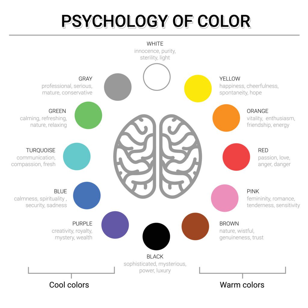
How To Pick Your Colors
Picking the right colors for your brand and logo design starts with recognizing the specific niche that your brand resides in. Is your branding energetic and ready to rush into new situations or is it more about a responsible, time-tested approach? Both of those brands could use the color red, but they would use different shades and in different contexts.
The right brand colors help you define your space rather than oversimplifying what your company stands for. Remember, use the right colors—don’t the colors use you!
Insurance Websites offers the best website design service for brands. Their design team knows the psychology of branding and how to create a custom brand website that utilizes your brand colors, messaging, and helps direct your demographics towards your goals.
Reach out to Insurance Websites today to learn more about their services.
